Gap is the Biggest Wussy on Earth
Gap is the Biggest Wussy on Earth
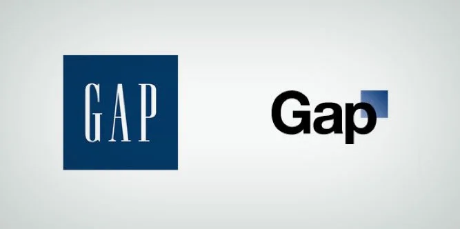
So we all saw the new Gap logo. It looked weird. It looked wrong. It looked like all sorts of other unbecoming words that were broadcast over Twitter and Facebook within hours of its unveiling.
Then, in what is going to be (or should be) remembered as the biggest corporate branding fail of the last decade, Gap caved in to all the little whiny Tweeters and defensively pulled its shiny, new logo.
Anyone who thinks that move was rational - that pulling the new logo was the best thing Gap could have done in the situation - is somewhere between equally ball-less and an idiot.
No, it was the worst thing Gap could have done in the situation. I've read a few posters who think the whole thing was an intentional rouse to gain attention. Far fetched. There are better ways of gaining attention than intentionally making your company look like a bunch of bumbling idiots. That's not it.
I'm sure Gap thinks they were "using the medium intelligently to respond to consumer opinion" or something one might read in a Forrester report on social marketing. But really they are just pussies.
The fact is, any time you launch a logo redesign you have some people who complain. The new logo always "feels weird". It feels weird because it's different. Like the...mirror image of a photograph which never feels "better" than the original orientation - until you get used to the novel nature of it.
Critics crawled out of the woodwork - and the internet lets their short-term opinions sound big. But a company has to differentiate between that kind of blip, and the long-term strategic reasoning behind their decisions.The truth is - all those whiners would have gotten used to the new logo. And they would have come to associate it positively with the brand, so long as Gap continued to invest in it and in their creative marketing efforts as they have done.
When the iPad was announced by Apple - the whole world spent 2 weeks laughing at it and making comparisons to tampons. It was ridiculed. SNL did skits about it. People made YouTube videos roasting it. It was the laughing stock.Who's laughing now?
Apple had the balls to commit (this kind of thing really doesn't take much in the way of balls - just the basics - which is why Gap is such a colossal wuss). And iPad's critical consumer responses naturally waned, like all these things do. This wasn't an oil spill for christ sake, it was a brand.
You know, I hate to say it now - but I sort of liked the new logo. I mean it was Helvetica, sure. One might argue that seems old. But so are 5 dozen other logos that use it quite well. And Gap, maybe even uniquely, has the minimalist heritage to have owned the execution. The black and white was refreshing.
So the little blue square was sort of lame at first glance - but who knows how it all would have manifested across other products and marketing devices over time. Guaranteed, Gap, the nay-sayers would have wound down, and a new crop of less outspoken advocates would have embraced the new logo quite well.
You just had to have the very slightest teensy little balls a company can have.Instead you have displayed yourself to the world as an utter corporate whip. You've done more damage to your brand equity by pulling the new logo, than the blip of negativity that naturally comes with anything new.
Now I don't give a crap how "tough" or cool your models are styled to look.Now we all know - Gap is just a self-conscious little wuss.
